In this special series, we are releasing the cover designers’ exclusive musings on their creations. In hearing their thoughts, we hope the depth and creativity behind the covers bursts forth, bringing a new light to the face of Hendrickson’s books.
 Written by Tina Donohue, the cover designer of Surface Tensions:
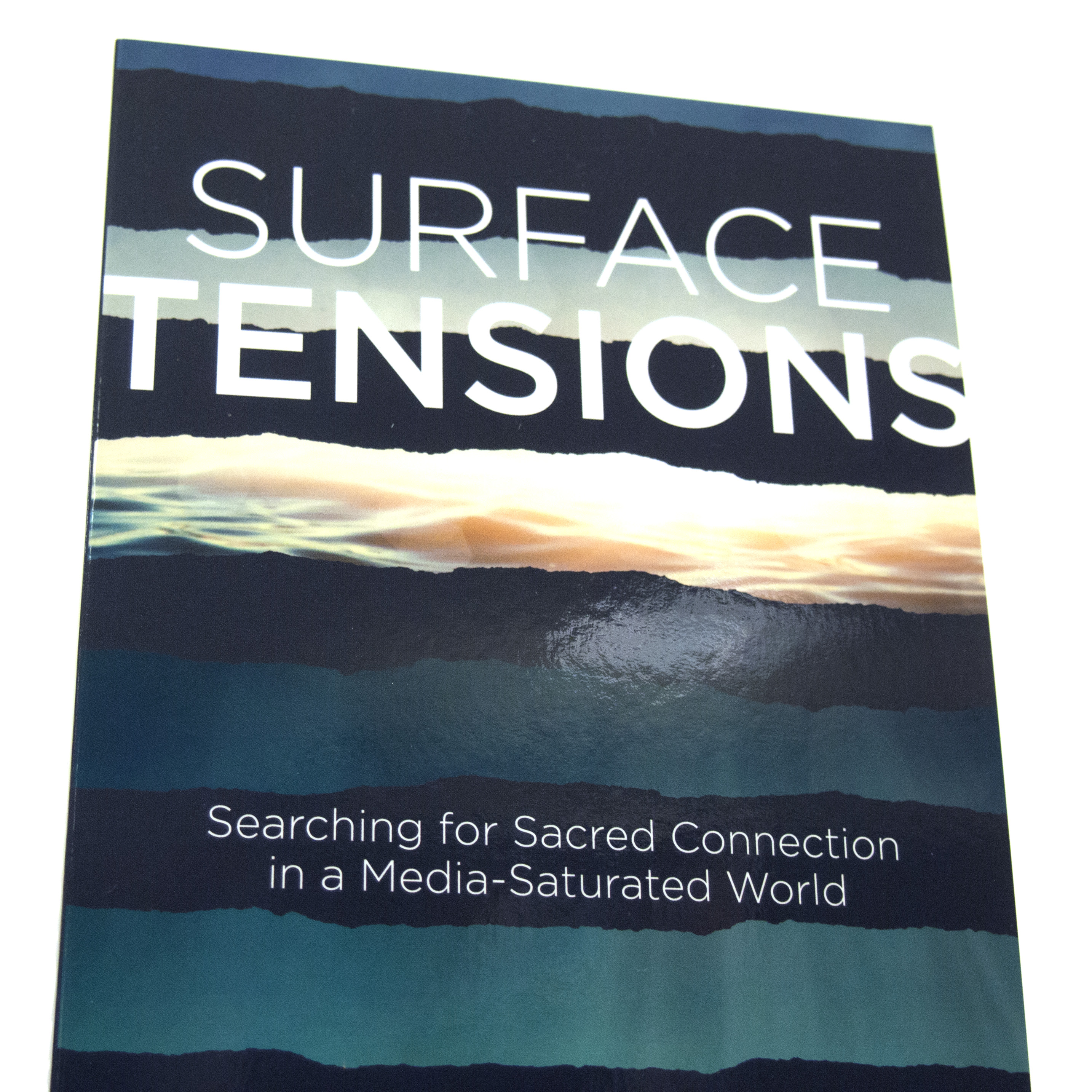
In approaching the design for Surface Tensions, I started by choosing a serene background image of tranquil, sunlit ocean water to represent the “sacred” that we all search for in our media flooded lives. I then covered the background image with dark lines that allow only a portion of the “sacred” to be seen. The dark lines serve a dual purpose. They have a jagged, torn edge effect to represent tension and frustration. The lines also create a sense of obscurity to the “sacred.” I chose simple, san-serif fonts that would not compete with the background. I added a feeling of tension to the title by having it stretch across the cover and bleed off the edges. Ultimately, the cover design represents seeing through the darkness, frustration, and obscurity to the “sacred.”
For more information about this fascinating book, check out this video interview with the author, Nathan Roberts, or visit our website.
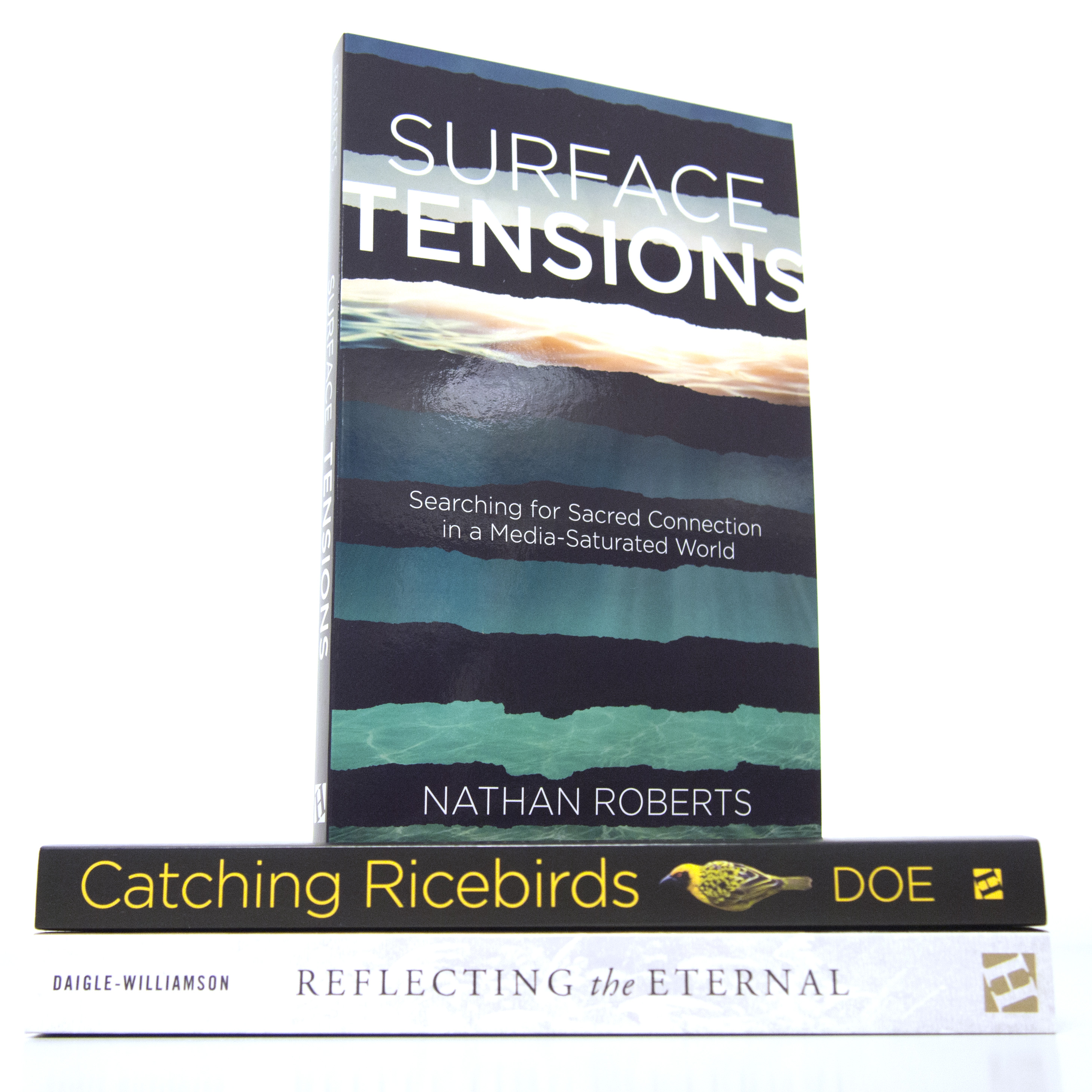
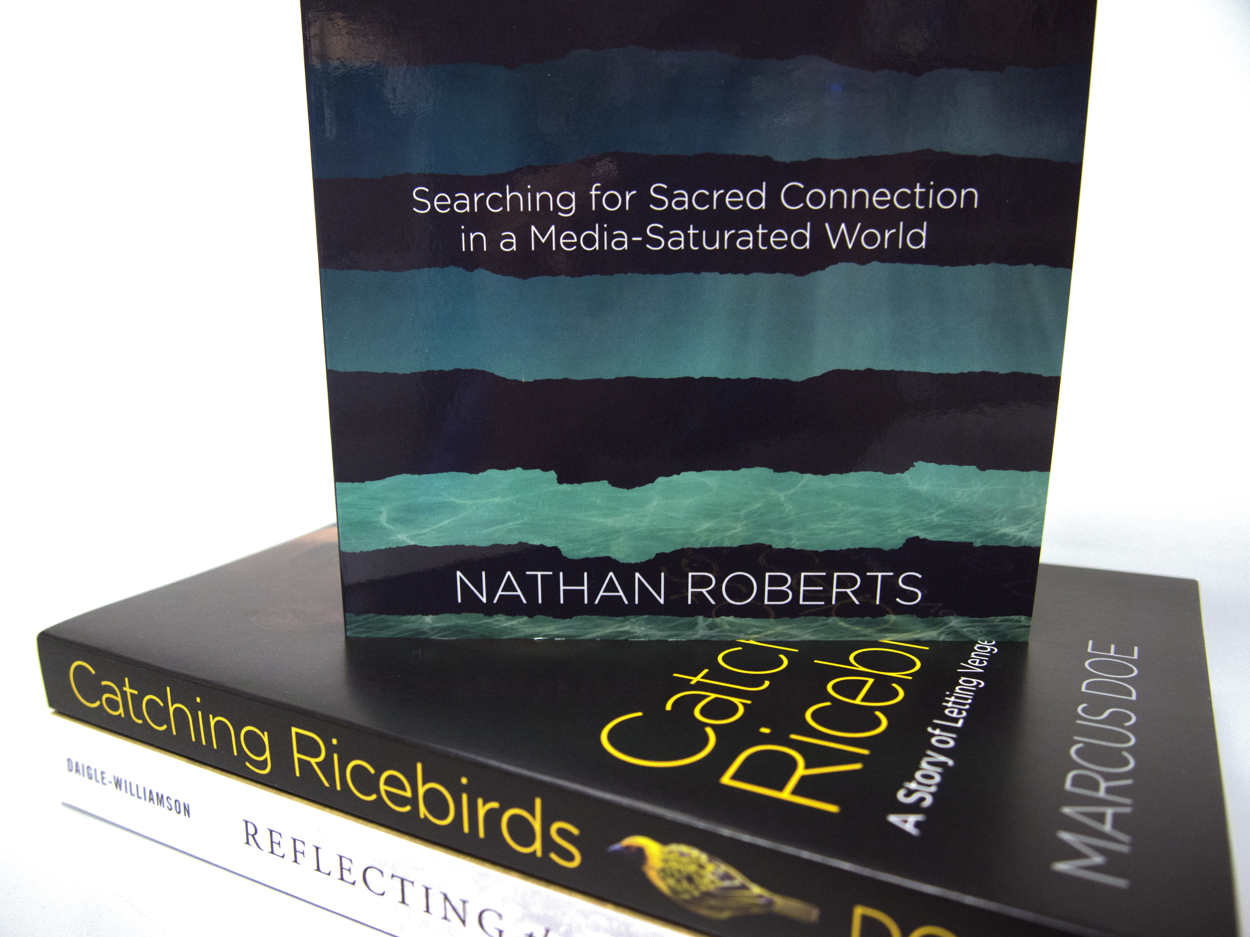
More photos of this eye-catching cover: